Pages

Showing posts with label research. Show all posts

Sunday, 6 May 2012

The Output: Basic Newspaper Research

The Guardian

Front Page
Across the top of the front page there are medium sized images which have been cropped and accompanied by captions introducing the stories further inside the newspaper. They are like snapshots of the issue and some quite typical, for example, 'Red or dead? United slip puts title in balance. In sport'. There is a quick heading, a small summary, where the story is located in the paper and a football related photograph, all the size of a credit card. Using these photographs in this way catch the attention of certain audiences looking to read about specific topics. Seeing just the cover of the newspaper with these images on may convince them to buy the paper because they know what they can find inside.

Below this strip across the top, there is a thick, black line separating it from the rest of the page where the stories lie. Beneath this is the headline associated with the picture and the column beside it. This is the main current story the newspaper is covering and continues within the paper. The image stretches across 4 out of the 5 columns; a large image for the main story with a caption beneath in a small font.

Below this again is another thinner line separating the two big stories. There is a larger headline, with a subheading and 4 short columns, continued inside the newspaper.

Across the whole front page there is another line separating the top of the paper with the main stories  on and there are two more examples of stories inside; one begins on the cover and continues inside. There is a small picture; a little larger than the size of a postage stamp printed among the columns of this story where there is a bold piece of writing of equal size next to it. The bold font giving emphasis to the importance of this information in conjunction with the story.

***


50 Photos Dictionary (by Fanny Wacklin Nilsson)

"A newsprint publication displaying 35mm film photographs. It is a personal dictionary of a few selected words, of which the photographs are presented in relation to, and my personal relationship to them."
  • This is a 12-page newspaper (including cover and back page with index).
  • There is a mixture of typography: large italic font used for the few headings across the pages; smaller typed font; hand-written pieces.
  • Each page layout is different and seems personal - especially due to the handwritten bits of texts interjected throughout. For instance, there are a few large chunks of writing which describe wither one or a couple of photos on the page, and in contrast, on the cover there is only a single line of text captioning the photo.
  • The photos are all different sizes, and placed in all different places throughout the magazine - some accompanied by text, some not. For example there is a series of three images of a bicycle with nothing written with them (but on the other wise of the spread in the centre), and on the page before that there is a single image aligned to the right of the page and placed halfway down with the paragraph of hand written text beneath it aligned to the left of the bottom of the image.
  • The layout is irregular and the look and style seems to be minimal with a lot of white space.

Monday, 26 March 2012

Time Machine Essay: Research so far...

I have decided to centre my essay around the theme of beauty and the sublime. I was inspired to write about this specifically through reading ‘Photography: the key concepts’.

"The development of the concept of the sublime as an aesthetic quality in nature distinct from beauty was first brought into prominence in the 18th century in the writings of Anthony Ashley-Cooper, third earl of Shaftesbury and John Dennis, in expressing an appreciation of the fearful and irregular forms of external nature, and Joseph Addison's synthesis of concepts of the sublime in his The Spectator, and later the Pleasures of the Imagination. All three Englishmen had, within the span of several years, made the journey across the Alps and commented in their writings of the horrors and harmony of the experience, expressing a contrast of aesthetic qualities."


Visual Reference: Ansel Adams, "Autumn Moon"

Contextual findings
Yosemite National Park was established in 1890. The park was established to preserve its resources, which make it so unique and attractive, as well as to allow future public enjoyment.

“Yosemite National Park is a world heritage site which has made a significant contribution to California's cultural heritage, to the national park movement, and to Yosemite's 4,000 years of cultural heritage by Native Americans.”

Native Americans populated the national park before it became so, and before Euro-Americans arrived on the landscape.

http://www.yosemite.national-park.com/info.htm
http://www.nps.gov/yose/historyculture/archeology.htm


F64 Group
  • Established in 1932 by Ansel Adams, Edward Weston, Willard Van Dyke, Imogen Cunningham and some others.
  • It deals with the concept of “straight” photography.
  • The group was in response to the "artistic," soft-focus, pictorial type of photography which was popular at the time.
  • Emphasis was placed on "pure" photography, sharp images, maximum depth-of-field, smooth glossy printing paper, emphasizing the unique qualities of the photographic process.
  • The significance of the name lies in the fact that f/64 is the smallest aperture on the lens of a large-format camera and therefore provides the greatest depth-of-field.
  • The members of Group f/64 believe that photography, as an art form, must develop along lines defined by the actualities and limitations of the photographic medium, and must always remain independent of ideological conventions of art and aesthetics that are reminiscent of a period and culture antedating the growth of the medium itself. 
http://kcbx.net/~mhd/1intro/f64.htm


Edmund Burke
As well as being the author of ‘A Philosophical Enquiry into the Origin of Our Ideas of the Sublime and Beautiful’, Burke was a statesman, orator, political theorist and philosopher. Burke believes that the ‘Beautiful’ is what is well-formed and aesthetically pleasing, whereas the ‘Sublime’ is what has the power to compel and destroy us. The transition from the Neoclassical era to the romantic era was marked by the preference from the sublime to the beautiful.

The Commission - My Research: Anne Hardy

Anne Hardy's photographs of constructed sets of unusual interiors is what she is primarily known for. This work of hers consists of items and furniture which she has collected from places like markets and jumble sales or skips - second hand, and arranged within her studio and then photographed. In this sense, she relates very well to the subjects within my series because there are links evident (in both her photographic choices and with my series) with the population and the second hand market.

Cipher
Aspects in some of Hardy's work such as in Cipher, provide a painterly and atmospheric aesthetic. This is achieved by the hazy glow being produced by the fluorescent lights; the " faux grotto" walls; and the differing levels of the hanging ropes having an effect spatially upon the room. These aren't just objects found carelessly on the street and thrown into a room together to produce something that could look kind of cool. They are carefully considered objects being places appropriately with each other to create a style which is then complimented with the decoration and technical choices Hardy makes. They are works of art. Hardy often admits to reshooting her images, even if the changes made is moving an object by centimetres.

*** 

Prime

This second image including the skylights relates well to my choice of using natural lighting because of how the source of light in her work is intended to, and does a very good job of looking like natural daylight. It further evokes the feeling of the set being a regular but just unusually adorned room, which in reality, it is not.

***

Untitled VI

In an article on 'The Guardian' called "Anne Hardy's best shot", she speaks about an image of hers she particularly likes from 2005. Her sets built in her studio are centred around the camera so it is more photography related than an installation. She used a medium format camera, like I chose to do, and a wide angle lens which makes sense to photograph a whole "room". I used a standard lens however, as I was only photographing certain scenes in a room.

***

A major similarity between mine and Anne Hardy's work, is that  it somewhat showcases the second hand market. Although Hardy uses a lot of small objects and waste in her images to fill up the room, she also uses furniture and larger objects - this is where the second hand market comes into it and more specifically; it's availability.

Through her printing method Hardy gives the viewer of the image a sense of looking into the room. This is aided by the inclusion of so much of the space and objects in her photograph - namely, her choice of a wide angle lens.


References:
http://www.guardian.co.uk/artanddesign/2007/jan/11/photography.architecture
http://www.saatchi-gallery.co.uk/artists/anne_hardy.htm

The Commission - My Research: Alex Soth

"I fell in love with the process of taking pictures, with wandering around finding things. To me it feels like a kind of performance. The picture is a document of that performance".

Alex Soth expresses the need to tell a story through his photography and express the narrative but admits he struggles to do so. "Photographs often leave me feeling like something is missing". This is almost like what I wanted to do with my photographs - tell a personal story.

It is an opinion that the best photographs inspire curiosity rather than satisfy it and I believe I may have achieved this is my series with the simplistic framing and the subtle use of money that will make people wonder what the significance of it is. Hopefully people will look at my series and want to know what the significance of the people in their locations are too and their link with them, and in turn, understand the context. I think this is also a similar element in Soth's work. For example, his photograph below, of an older male next to what looks like a cabin holding a model aeroplane in each hand.

Soth talks about how the house caught his eye. He went and enquired and met the man's wife who told him that he had in fact build the house. She also explained how Charles and his daughter built model planes in the room he called his 'cockpit' on the 4th floor entered via a ladder. The room was small and lined with windows; too small to photograph in. The photograph is taken on the roof.

 'Charles, Vasa, Minnesota 2002'

This image provokes my interest (just as Alec Soth talks about this house and the people provoking his) and there also seems to be some juxtaposition between the apparent age of the man and the fact that his hobby is often also shared by children.

The isolation of the subject relates to how I have chosen to frame my subjects with a shallow depth of field. Although the second hand items are important in my series and to my concept, the concentration on the subjects is to give it context and I chose to do this to make it personal.

***


This image of Soth's would have been a perfect visual reference for my concept had I pursued my first idea about photographing a constructed set in a random location.

***

Two visual references of Alec Soth's which I found inspired my photographic choices are the portraits below of the women in what seems like their homes. They seem to suit the colour tones in the rooms. It is their posture and their relationship to the camera which I have recreated in my own series as well as their natural expressions and contexts within the photographs.


References:
http://www.seesawmagazine.com/soth_pages/soth_interview.html

Sunday, 11 March 2012

Time Machine Essay: Visual References

I have decided to centre my essay around the theme of beauty and the sublime. I was inspired to write about this specifically through reading 'Photography: the key concepts'.


"The development of the concept of the sublime as an aesthetic quality in nature distinct from beauty was first brought into prominence in the 18th century in the writings of Anthony Ashley-Cooper, third earl of Shaftesbury and John Dennis, in expressing an appreciation of the fearful and irregular forms of external nature, and Joseph Addison's synthesis of concepts of the sublime in his The Spectator, and later the Pleasures of the Imagination. All three Englishmen had, within the span of several years, made the journey across the Alps and commented in their writings of the horrors and harmony of the experience, expressing a contrast of aesthetic qualities."


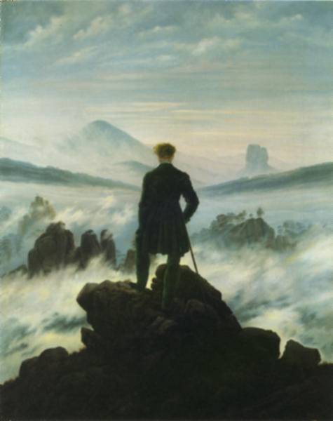
Casper David Friedrich
"Wanderer above the Sea of Fog"
"1818

Friedrich choses to base his landscapes solely on locations in Northern Germany where there are beautiful scenes of scenic trees, hills, harbors, as well as different and atmospheric lighting conditions like misty mornings and other light effects based on a close observation of nature. “Some of Friedrich's best-known paintings are expressions of a religious mysticism."

***

Ansel Adams
"Autumn Moon, the High Sierra from Glacier Point"
1948
"Ansel Adams was a visionary figure in nature photography and wilderness preservation. He is seen as an environmental folk hero and a symbol of the American West, especially of Yosemite National Park. Adams' dedication to wilderness preservation, his commitment to the Sierra Club, and of course, his signature black-and-white photographs inspire an appreciation for natural beauty and a strong conservation ethic."

***

Friday, 9 March 2012

The Commission: Contextual 'Waste' project research and developments

I decided to do some more contextual research into the benefits of the second hand market and discovered another very important layer to my concept. Recycling furniture through the second hand market benefits not only the people involved but the environment. This is because the use of resources in manufacturing new furniture is reduced and therefore less "waste" is produced. So not only are people finding a home for second hand furniture considered waste to some, but they are stopping the necessity for the disposal, recycling and process of it becoming technical waste.

A also looked more into the links between the second hand market and our current economic status as I want to make a comment about this. Freecycle is a website devoted to allowing the exchange of second hand items.

"The worldwide Freecycle Network is made up of many individual groups across the globe. It's a grassroots movement of people who are giving (and getting) stuff for free in their own towns. Freecycle groups match people who have things they want to get rid of with people who can use them. Our goal is to keep usable items out of landfills. By using what we already have on this earth, we reduce consumerism, manufacture fewer goods, and lessen the impact on the earth. Another benefit of using Freecycle is that it encourages us to get rid of junk that we no longer need and promote community involvement in the process."

By October of 2008, the number of internet searches in the UK consisting of the words 'second hand' had increased by 22% in a year. Cars, books and furniture are among the top listed. People realise that they can save money and help the environment by purchasing second hand items and this is what I want to display in my series.

***
  • My selection of the furniture in my images will hopefully lead viewers to realise the nature of them because they won't look like the new, perfect, modern products selling now - they are not newly bought or made.
  • The way in which I frame and compose my portraits will also hopefully draw emphasis to the furniture, and therefore their appearance and showcase it well. My subtle use of money (present in the image but not in sharp focus) will emphasis the economic benefit.


References:

  • http://www.kimberlymichaudinteriors.com/kami-online-design-services-0
  • http://uk.freecycle.org/
  • http://weblogs.hitwise.com/robin-goad/2008/10/second_hand_goods_classifieds_freecycle.html