Pages

Showing posts with label environment research task. Show all posts

Wednesday, 22 February 2012

Research Task: Laura Dack's research for my project

Concept: the lack of a recession for the second hand market and the availability of hand-me-down products

ANNE HARDY
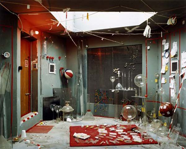
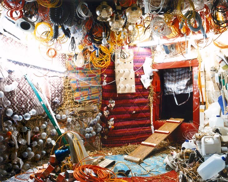
Hardy’s work is constructed within empty spaces, repopulated with sourced second hand furnishings and objects that reanimate the ‘room’ into discombobulated, dystopian environments. The lack of displayed human interaction leaves us to create how the rooms came to be how they appear, rendering their disorientating appearance ‘dreamscapes’. Her images appear painterly, as they are constructed to be viewed purely from the camera’s vantage point, producing a purely two-dimensional environment. The images will always appear unreal or fabricated, yet the scenes depicted still ‘possess’ the space.

In looking at her work, the concept of using an object from someone else’s life to create a new pictorial one springs to mind. Second hand objects carry with them a story of their past ‘life’ and in creating new images with them it carries on both their legacy and their function. Reusing furniture reduces waste that has been created by fly-tippers, but can be used to a similar visual effect, as if they have been dropped into the scenes.

Detatched, 2009
Cell, 2004
Untitled VI, 2005


MARIO CAICEDO LANGER
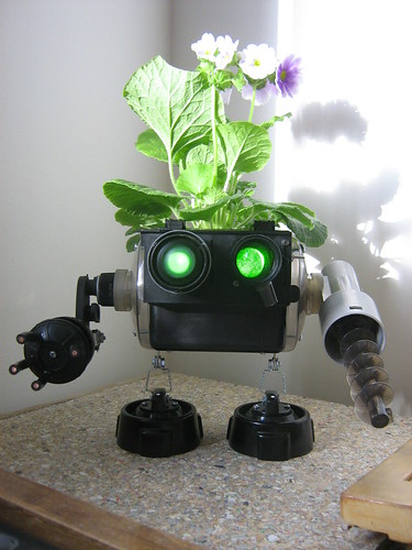
Langer works with broken gadgets, scrap metal and other unwanted waste to create a series of cyborg-style sculptural creations. He reuses a common waste product due to the vast increase in electrical consumerism and consumption in the past thirty years. The forms he creates take items that would otherwise take a lot of energy to melt down into bi-products and reform, and creates new products that can be reused in their reincarnations.

Langer’s art inspires ideas of using found, ‘unneeded’ or refused objects to create something functional once more, such as ornaments as he did, or other items such as furniture. 

Tin Man, 2009
Robo-Planter, 2011


MATT WAIN
I came across this commercial photographer when researching photographers who shoot portraits of people in their personal environments. I was drawn to using his work as an example in this research as in these shots the use of the environment expresses the idea that people have a relationship with furniture and visa versa. This made me think about the change that occurs to cast-off or second hand furniture that is bought or collected; does it lose its story/surface memory when passed from one person to another, and how does it reincorporate itself into a new environment.

Obviously the furniture in his images doesn’t suggest they are second hand but it is relevant to the portraiture theme of the project to see the relationship between subject and environment. From this I personally would be inspired to photograph the homes of those who collect second hand furniture but, unlike the work of Anne Hardy, I would have the subject in the image to draw parallels between the furniture and the owner, suggesting the personal relationship between them.


KATIE THOMPSON
Thompson is a South African designer who fashions furniture from recycled objects, such as old suitcases, buckets and umbrellas. The pieces she creates have a vintage finish to them, showing that recycled goods can seem upmarket and need a second glance to notice why they have a quirky edge to them, rather than old rusty objects cluttering up gutters. The concept of recycling objects before they decompose or lay waste in a rubbish dump is a fast growing concept and many boutiques offer these kinds of products.


My research has inspired me to come up with an idea to collect objects from people I know and from fly tipping that are no longer wanted or needed to craft a new environment in a studio. Although overly ambitious, this is what my visual concept would start out as:

I would use these objects to reconstruct either a 360˚/270˚ scene of a room, or multiple single vantage point scenes of a room, and photograph various parts of the scene to create various narratives about the suggested inhabitant of the scene. I would construct furniture in the style of Katie Thompson, by using bits of furniture and other objects. I would be tempted to pastiche the dystopian backdrops of Anne Hardy’s work and also her use of hanging objects to fill the room so that no part of the image(s) is empty.  

If I were to create just one scene, I would shoot it from various angles with a shallow depth of field focusing on the key item in each image, which I would intend on basing a story around.

If three separate scenes were created, I would shoot with a large depth of field to emphasise the sheer amount of objects, as I would aim to cram a lot into one area, creating jumble heaps, much like scenes in the movie Labyrinth in the junk yard where children’s forgotten things end up.

I would light it with the studio’s own continuous overhead tungsten lighting and use a softbox flash, to recreate interior lighting and a natural light source like a window to highlight some objects, possibly coming through a fake window.


Tuesday, 21 February 2012

Research Task: My research for Laura Dack's project

My research for Laura Dack's project.
Basic concept: the rate of decay and consumption concerning waste.


Who
 would 
you 
look 
at 
and 
what 
ideas 
can
 you 
take
 from
 those 
photographers/artists
 in 
order
 
to 
structure 
the 
project?


David Maisel
David Maisel is a perfect visual reference for the aspect of decay in this concept in terms of both still life and landscapes and he would definitely be an influence of mine. Popular work of his comes in the form of the still life images he has produced from photographing copper canisters originally kept at the Oregon State Insane Asylum (where 'One Flew Over The Cuckoo's Nest' was filmed in 1975). 


Having looked into these photographs, I discovered that the copper of the containers reacted with water when they were kept in an underground archive at the asylum which flooded numerous times over a number of decades. This is what caused the different formations and colours on the cans during their time in the depository where they were left. The canisters contain ashes of patients who were never claimed by anyone. Each can is individual and unique, just like we are. Metaphorically these cans become almost like portraits of the people who's ashes reside inside.


"These deformations sometimes evoke the celestial - the northern lights, the moons of some alien planet, or constellations in the night sky. Sublimely beautiful, yet disquieting, the enigmatic photographs in Library of Dust are meditations on issues of matter and spirit."


As is evident from the above photograph, Maisel uses a very shallow depth of field which highlights detail in the formations; similarly to how a portrait photographer may use a very shallow DOF to focus on the eyes of their subject to highlight their importance. Maybe Maisel is trying to say something about these people through representing the cans in this way specifically.

Despite the nature of the objects and the negative connotations linked to them through their origin, the subjects in their present form are strangely beautiful. The shallow DOF aids this but it is predominantly the colour and detail in the photographs that makes them so.

Maisel’s 'Library of Dust' monograph was called “a fevered meditation on memory, loss, and the uncanny monuments we sometimes recover about what has gone before" by The New York Times.

***

From looking at the interior images of the Asylum taken by Maisel, vibrant colour and either natural light or light coming specifically from lightbulbs seems to run through all of his images in this body of work. To me this makes them striking just like his photographs of the canisters.


There is something strange about the beautiful natural light coming in from the windows and the brightly painted walls when perceiving this in context - this is a stark juxtaposition with the nature of the location and it's history although this is displayed visually also through the peeling paint and random rubble carpeting these same rooms. I personally really like these photographs. Both elements photographed of the Asylum - the canisters and interiors and part of Maisel's body of work 'Library of Dust'.

The DOF used for the photographs of the interiors is larger than that of the canisters. This allows the details of the peeling walls and the dirt lining the edges of the room to retain their detail as these are important aspects of the photos visual elements and meaning. The natural aesthetics that both sets of these photographs take on are something that can be used in your own project to help structure it. It makes them more relatable in the sense of their realism and also how we often strive for beauty.


References:
http://lookintomyowl.com/david-maisel-library-of-dust.html
http://davidmaisel.com/works/lod.asp
http://davidmaisel.com/


Robert Polidori
Robert Polidori has created photographs of destroyed interiors after the New Orleans flood, the aftermath of hurricane Katrina and photographed buildings greatly affected by the Chernobyl disaster. The visual approach to his images are similar in a way to Maisel's. The buildings are adorned with bright colours despite the negative context they are in.

It is said that "Polidori transcends the limits of photography and captures traces of the human condition — paradoxically, in places that have usually been abandoned and are devoid of human presence. Each photograph amounts to a social portrait, revealing the soul of its various subjects, and layering both past and present in poignant works steeped in sorrow and beauty."


The theme of decay is as much evident in these images as Maisel's asylum work. I get the impression more from Maisel's series that these places have been abandoned for a long time which supports the concept of the rate of decay specifically. However, Polidori's seem more like it is simply documenting the stare of these interiors.

Other similarities between the two interior works which I feel work very well are:
  • the large depth of field displaying the detail of the decay and allowing all aspects of the images to become equal in importance (and for the scenes to be viewed as a whole).
  • The seemingly natural light providing some beauty to the devastating scenes.
References:
http://arttattler.com/archiverobertpolidori.html


Andreas Gursky

A good photographer to look at in terms of consumption which his project particularly his 99-cent work. He photographs things on a large scale, which would relate to a theme of a fast rate of consumption.


References:
http://en.wikipedia.org/wiki/99_Cent_II_Diptychon

***

How 
would 
you 
choose 
to 
portray 
the 
concept?

I would chose to portray this concept though landscape or the interiors of decaying buildings because these can look very effective when the decay is displayed through a large scale. However, a smaller still life could be very intimate and more personal just as Maisel's canisters are.

Specifically photographing buildings after certain events when the times of the event and the time of the photograph being taken are known, relates to the 'rate' of the decay. As well as decay, the theme of consumption could be portrayed through photographs of commercial interiors such as shops and supermarkets. Utilising a long exposure time and therefore blurring movement of people could represent the rate of consumption also.

***

What 
visual 
tools 
would
 you
 use 
to 
represent 
the 
concept
 (what
 would
 the viewer
 encounter
 in 
your 
image)?

I would personally use a large DOF to include all the detail of the scenes and to equalise it; just as Maisel and Polidori to avoid isolating importance to certain parts of the focus. I would most likely use a large format camera with a wide-angle lens for optimum detail.

***

What 
would 
the 
visual 
elements 
of 
your 
image 
be (composition, objects/subjects 
within
 the
 pictorial 
frame)?

This would depend mainly on whether the theme of decay or consumption is chosen. I feel taking a similar approach to Gursky and photographing consumer related interiors relates well to the specific rate of things occurring (such as consumption). In this case I would try to include as many materialistic objects like food and general shopping items into my photographs as possible.

However, I think the rate of decay is even more interesting. The rate specifically of decay may be hard to represent. Possibly just the theory of decay due to certain circumstances would also work. These circumstances being things like natural disasters that Polidori works with.

***

What 
would 
be 
your 
visual 
choices 
in 
the 
images
 (focus, 
distance, 
lighting, camera
 position
 etc.)? 
  • I would choose to use a large DOF as I’ve already mentioned and have the whole photograph in focus.
  • I would take the photographs from a medium distance if working with decay to involve much of the scene. It is not a macro image but in the case of the rate of consumerism, a further distance away would work a lot better to include as much repetitiveness of objects (and possibly people) as possible in the images.
  • I love the look of the natural looking light if taking the route of the abandoned and decaying urban buildings – it contrasts so greatly. Artificial lighting seems to relate very well to the concept of consumerism.

Wednesday, 8 February 2012

'The Portrait Issue' Research Task


'Changing Pace, David Weir', Finlay MacKay


Aesthetically, this image of David Weir, photographed by Finlay MacKay is very vibrant in colour. There is a great sense of movement in the photograph which is created by many things: the left leaning tree; the shape of the winding road expanding in the foreground; the posture of Weir, leaning into the speed. This is an effective element of the photograph due to the fact that it is part of a commission for the 2012 Olympics. The theme fits in very well.

Judging by the shadow, the photograph was probably taken late afternoon. MacKay has used strobe lighting which casts strong light over his subject causing him to stand out. This method means the viewer can pick him out of the photograph as important which he rightly is. The tonal range is great, with the highlights on the subject down to the dark trunks and shadows beneath the trees in the background. The DOF is large as most of the image is sharp. I might have expected a shallower depth of field to pick out Weir from the image so the viewer can focus more of their attention on him.

The photograph has been taken from a regular eye level view, from a point not too far ahead of Weir so in a sense we see him approaching us - further adding to the sense of movement evident in the image already. MacKay favours 80mm and 50mm lenses. This particular photograph has most likely been taken with an 80mm lens.

MacKay's photographic technique is creative because he has stitched together multiple digital images to make this final photograph. Similarly, for his first commercial campaign which was in 2002, MacKay used multiple negatives to produce his final image.

'Actual Life', Toby Glanville

Glanville took his series 'Actual Life' over a period of 3 years (1997-2000). He has an eye for integrity; things unaffected by commercialisation which is very evident in this image of his from the series simply through it's aesthetics.

The concept of the image seems to be a portrayal of a 'real' woman, caught as she's doing what she does every day, therefore it is 'actual life'. Judging by her clothing and the environment and context of the photograph, it looks like this woman is a teacher.

Glanville's single subject stands almost completely in the middle of his frame, just as MacKay's subject is. She is looking straight into the camera which Glanville obviously has held to his face for us as a viewer to see this woman with equality. There are no feelings on either side of superiority or inferiority. The expression on her face is natural and friendly and her pose seems her own.

The lighting in the photograph looks very natural, coming in though the window on the right. We can see the shadow of the window and blinds projected into the board behind the woman which is joined by her shadow. This and the highlight on the side of her face prove a good tonal range although the shadows aren't extremely dark or the highlights extremely bright. The soft lighting seems to relate well to Glanville's subject and the idea she is portraying of herself through her pose and expression. The depth of field is also quite large, like MacKay's. Both images portray a lot of detail to the viewer.

A big difference between the two images of Glanville's and MacKay's which jumps out at me is that of the camera position and how although the movement in the first seems to guide the subject towards us, we have no real connection to him like we do in Glanville's where the woman is making eye contact. This may cause some people to feel a lot more like they can relate to her with this connection and I think any other pose wouldn't work as well or be as effective as this one. This leads me to believe that the visual approach Glanville has employed means the viewer can read into the image in their own way; based on agenda background and identity more so than MacKay's or Gebert's.

'Freischneider', Ulrich Gebert

This is a portrait of a hedge cutter in his uniform and protective clothing out of context from his 'garden' as such. The significance of this separation is that "physical confrontation between man and nature is hardly necessary anymore to validate the claim to power". However, it also causes some confusion because the man has been taken out of context.

The prime similarities between the three photographs are the use of a single subject and the use of colour.

The gaze of the subject is very different in each. We only have eye contact with Glanville's subject like a traditional portrait which makes the photograph have a more emotional outreach to the viewer. And Glanville is fond of the traditional. The gaze of MacKay's subject is very much concentrated on his task which is what we notice about the photograph - what he is doing and how. Lastly, the gaze of Gebert's subject is elsewhere like he has been snapped unaware. He has a very focussed expression on his face.

The framing of Gebert's image is not at all like MacKay's and Glanville's who do not take their subject out of context as Gebert has done. We wonder what the subject is looking at. The camera position is quite close to the subject, much closer than Glanville's and MacKay's who are appearing to have more similarities. The depth of field is large - just as in the previous two photographs and we can see all the detail in the face of the man and his clothing. The photograph has been taken using a flash which creates the bright highlights. There are some shadows however and the tonal range is about average.

Thursday, 1 December 2011

The Contemporary Urban Environment

Deconstructing Environmental Photographers

"For many contemporary photographers the city remains an enigma: a spectacle that cannot be resolved. The experience of the contemporary urban fabric is endlessly complex and ambivalent." For this reason, it is possible for photographers of the urban environment to take so many different approaches in portraying it the way they do.

Rut Blees Luxemburg
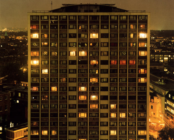
Luxemburg works at night; shooting her images using long exposures to capture the street lights and other lights on in buildings etc. This technique leads to the majority of her work having a warm tone. This accurately portrays night time scenes in their reality aided by the physical lack of people and figures. An opinion of Luxemburg is that she shows "humanity within empty urban spaces, areas that are rarely thought of as beautiful or warm yet hold so much human life."

Luxembourg is a German photographer. When she visited London she noticed the very visible high-rise buildings in the city due to how little of them there were and the difference between London and Germany. The visibility from them is what interests Luxembourg. As well as her photo being of an elevated view, it has been taken at one - the 16th floor balcony of an opposite building. This was in the 90s when buildings like this were much more open and not restricted so much. She was free to wonder up and take the photograph. She has used a large depth of field to include all of the detail in the whole building and the focus is of the building while it is centred compositionally. The tonal range of the image is vast as there are dark blacks (mainly in the background where things start to disappear) and bright highlights in the lit windows of the tower block. The lighting conditions of her image is ambient with a long exposure as is common with her work. To fully capture the image, Luxemburg used a large format camera with an exposure time of 10 minutes.

Commenting on her own work, Luxemburg views her photograph as a "living sculpture" in the sense that she sees the building as having a sculptural quality to it but also the presence of people in the building during her exposure - watching tv and turning on and off lights as they entered and left rooms. Therefore Luxemburg's visual strategy to representing the city was focused on both the aesthetics and the inhabitants.

This image of Luxemburg's on the right is startlingly different to the previous. Rather than compositionally and perspectively perfecting her image, this photograph in particular looks more like a snap shot; less thought through and considered.

This image, unlike her other and unlike most of her work, includes arbitrary things like fencing just visibly along the bottom; a small brick building on the left and an element of nature creeping in at the top. Again, she has evidently utilised the ambient light, and focussed on the building where there are signs of humanity as she has admitted she likes to show in her work, and therefore the objects in the foreground are out of focus such as the leaves.

There are clear differences between this photo and her former image: it has not been taken from an elevated view but a street level view; it has not been controlled perspective wise and centred like her other work; and the tonal range is not as great because there are less dark shadows. However, Luxemburg has still managed to portray the existence of life through using a theme of lit windows in both of her images.

Luxemburg also photographs abandoned spaces in urban environments. The composition of this image is very interestingly divided into two halves with the ambient light causing the left side to be brighter and warmer in tone. The range is similar to the rest of her work: bright highlights and black shadows. She has also suggested a sense of humanity in the image but through a different method than her other photographs. The graffiti and markings demonstrate previous human existence which she is interested in.

Her focus is on the middle of the image; the depth of field not either of the two extremes - detail can be drawn from the whole photograph. The camera position is at a standing level. Like all of her night shots she will have used a tripod for a long exposure in the ambient light. The mood of this piece comes across as calm. Luxemburg hasn't cut any corners in representing this space as it is. A viewer can clearly see the grime on the wall and the dirty ground but they are not the focus of this space in this particular photograph. I recognise the atmosphere and the tone and the abandonment. It doesn't come across as to me as just another dirty underground passage.


Richard Wentworth
Wentworth uses the medium of photography to document his sculptures of every day life and other occurrences. Like Luxemburg, he acknowledges the presence of human life through creative and interesting devices such as this:

Wentworth has captured this makeshift action which someone has used to keep open their window. The photograph has been taken with a shallow depth of field; evident through the out of focus foreground and surrounding wall. The focus of the image is the teacup because it is the object which is serving it's purpose and holds more importance than the rest of the image. The camera position is at window sill height to relate to the teacup and document the action properly.

Wentworth's visual strategy seems to be focussing on actions of the public and how they behave towards the urban space and how they change it. Perhaps he is documenting the marks we make on the environment. Unlike Luxemburg who seems to focus on much larger spaces and themes, Wentworth's focus is much smaller: he does not photograph cities and buildings but the marks humans leave on them.

This image of Wentworth's is simply of a bottle stuck between two sticks. The composition seems inconsiderate, the colours common and the mood non existent. It seems to me that this image is very lacking in photographic skill and I cannot appreciate it's purpose as it seems there is none. The previous image was taken to capture something. There is nothing of worth in this image.

However, like his other work the depth of field is shallow and he has photographed an object put somewhere by someone. This shallow depth of field draws attention to the focus of his image: it's not a photo of a tree and bottle in the street, it is a photo of a tree and a bottle. This someone is unknown though which is a theme which seems to run through his work. It is obvious the lighting conditions are natural - a similarity between Wentworth's and Luxemburg's. Some differences between the two approaches to representing urban space is the camera angles in some cases and the tonal range. Wentworth is looking down at his subject and his tonal range is not as vast in any of his work as Luxemburg's is.

In this photograph of Wentworth's he has captured a concrete imprint of a footprint which is filled with water. It is a close up which makes the depth of field unclear. Unlike any of the previous photos I have explored the camera angle of this image is a birds eye view looking down on the focus of the image. The lighting is clearly ambient and the tonal range is barely there.

Like the rest of his photographs this seems like a snapshot which suits his approach to presenting the urban space by documenting humanities effect and presence. In process and technique his images are very different to Luxemburg who is a lot more considerate.


Vera Lutter

"Instability, uncertainty, suspense, and monumentality are entities that I consider and think about; they inform my work."

Vera Lutter is famous for her black and white photographs of architecture and cities created by using the camera obscura technique. She uses this because she views her camera as an architectural device and enjoys the relativity of this to her work of architecture. Her visual approach to portraying the urban space is intended to suggest the unfamiliarity of it - she changes the image and makes it look unfamiliar. The camera obscura allows light to pass through an aperture in a dark room and the image is projected, inverted, onto photographic paper which Lutter hangs on the wall to create paper negatives as an end result. At a glance her work looks like black and white night time shots but on closer inspection it becomes obvious they are not.

This image of Lutter's has been taken from an elevated view like Luxemburg's image of a London tower block. This means more is captured in the image. She also uses a large depth of field to ensure maximum detail in the cityscape and emphasise the geometric scale. There is a great tonal range in this image of the negative as there are very dark blacks and very bright whites. The focus seems to be directed on the closest building on the right which stands out among the other.

It is very repetitive and geometric in it's lines and shapes: the straight structures of the buildings, the long straight roads, the same sized windows patterned over the buildings. Lutter was commissioned by The Museum of Contemporary Photography to photograph Chicago and this geometric approach was the one she chose to represent the city. This is evident in other images of hers but this aspect of her photographs relates to Luxemburg's technique.


Lutter's image of Campo Santa Sofia in Venice is of classic Venetian buildings disappearing into the distance, two neat rows of gondolas and a tall building with windows and balconies.

The depth of field Lutter has chosen to use in her photograph is not particularly shallow, however; the soft reflections of the boats due to the long exposure make it look like a shallow depth of field at first glance. Despite the tonal range including dark blacks and bright highlights, the image is quite contrasted causing the involvement of less grey mid tones and therefore lowering the tonal range. This is a difference to her previous image which is a lot flatter.

This image, like the previous, is very geometric subject wise - the architecture and transport is very repetitive. This is like the first image of Luxemburg's I explored in the sense of repetition involved in architecture. It has been taken from an elevated view; again as seen in all the artists works, enabling more of the urban landscape to be included in the frame and different levels to be included like a view of each balcony level which would not be visible from a street level view.

This negative of Lutter's is a very different scene to the majority of her work which are of architectural structures and cities. While this image includes a very different subject, it seems a different approach has also been taken to photographing it. The angle it has been taken at is a very low ground level unlike her other work. The view is pointing slightly up towards the Pyramid to include the whole monument in the frame. The level is slightly at an angle which is also different to the rest of her work but relates to Wentworth's more inconsiderate compositions. The tonal range is similar to her image of venice: there is not a vast mid range but a big contrast.

A clear similarity between Luxemburg and Lutter is the long exposures chosen for their work (somewhere Wentworth doesn't fall into) Luxemburg uses it for involving and working with ambient light in her photography whereas it is difficult to gather Lutter's means as she has created black and white paper negatives - a major difference between hers and Luxemburg's and Wentworth's positive colour images. Although, Lutter's long exposures are relative to her interest of the themes of the realities of time and space which she tries to convey in her work and suggests why she has made this choice. Wentworth has no need for long exposures - photographing in natural daylight and objects falling more under the still life category.

Tuesday, 22 November 2011

The City: The Flatiron Building

Deconstructing Environmental Photographers

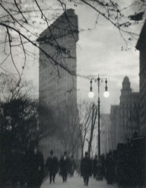
Edward Steichen, 'The Flatiron, New York', 1905

Steichen's photograph of the Flatiron building is taken from a great distance. So much so that other buildings beside it are visible and the viewer can make size comparisons, understand scale and appreciate the height of the building. Also, the building is centred unlike any of the other images. This could suggest the significance of the building as it was considered an icon of modernisation back in the 1900s after its completion.

Rather than the building itself, Steichen has focussed on the trees stretching across his frame nearer his camera and a couple of passers by in the street. He is concentrating on fleeting moments rather than the constant - the building in the background of his image providing context but it's importance still relevant. The dark tones of the branches and the figures cast against the pale background of the sky and the building creates contrast as well as displaying a large tonal range in the image.

Both Steichen and Stieglitz's images of the building were taken in Madison Square Park which enabled them to show the vertical rise of the building and was a conveniently large place to set up to take the photograph. The depth of field is quite shallow in this image of Steichen's but the effect is also aided by how far away in the background the Flatiron Building is.

Alfred Stieglitz, 'The Flatiron', 1903, and
Alvin Langdon Coburn, 'The Flatiron Building, 1911

Very similar in terms of photographic components are Alfred Stieglitz's and 
Alvin Langdon Coburn's images of the Flatiron. Their images both include 
trees and branches as an element of nature and the Flatiron building from a distance as well as a low street-level view and evident figures and signs of human life. They both utilise quite a shallow depth of field to focus mainly on the natural elements in the frame.

Stieglitz's image however doesn't include any obvious figures (there is only one small figure) and it almost seems as if the tree is what is really desired in the photograph and the building just happens to be there. However, the way in which the photograph is composed in two halves is intentional. Stieglitz said the building “appeared to be moving toward [him] like the bow of a monster steamer–a picture of a new America still in the making", and he obviously wanted to capture this feeling and show it's importance in his photograph. There is a shallow depth of field in this image as the tree is in focus but little else is.


Stieglitz took his photograph in evening light after it had snowed which gives it a very picturesque look. The flat tone of the photograph is due to his influence from Japanese wood-block prints. The lighting of Steichen's image and Coburn's image seem similar, maybe taken even later because it looks like there are street lights on and the street and the tone of the figures is quite dark.

These three images have a few small differences but share more similarities in terms of aesthetics. The photographs are complimented with landscape; thy are not architectural views of the building or portrayals of the building stading alone.

Walter Gropius, Walker Evans and Berenice Abbott have also portrayed the Flatiron Building through photography but in a very different way to Steichen, Stieglitz and Coburn.


Walter Gropius, 'The Flatiron Building, New York', 1928

Before Gropius took this photograph of the building, he had just resigned from a design school he both founded and directed and had been doing so for almost a decade. He is primarily an architect and the way in which he has taken his image of the Flatiron Building clearly shows his interest in architecture. The difference of the American architecture compared to where he'd come from surprised him. The concept of his photograph is very different from that of the previous three as he is seeing the building differently; through architects eyes so to speak. He does not portray the building along with other elements like Steichen, Stieglitz and Coburn have chosen to and also unlike the previous three the depth of field is large to include as much detail of the building as possible.

Gropius has taken his photograph from a very low angle with his camera directed upwards to include the height of the building in his frame while taking it at a close distance. This technique exaggerates the height and again, as in Steichen and Coburn's images, we gather a sense of scale by comparing it to other buildings in the photograph. The Flatiron Building here appears to dwarf others in the image which suggests superiority like Steichen has made the Flatiron Building in his image come across in a similar way. The image has been taken at an interesting angle which seems to allow the viewer to appreciate the architectural side and the size and shape of the building as Gropius would have done. Rather than the focus being on anything surrounding the building or any other aspects like nature and people, the focus of the photograph is solely on the architecture which is another difference this image has to the previous three.

Walker Evans, 'Flatiron Building seen from below, New York City', 1928-1929

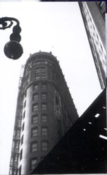
Walker Evans' image of the Flatiron is very different again. There are no people or trees or elements of nature framed in the photograph; neither does the image seem to show the architectural element of the building because little of it has been shown. Instead, it is framed by other things and the view of the building is front on as none of the previous have been.

It has been taken from a very low angle as Evan's includes in his title: "seen from below". It looks just like a view of the building if you were to stand in front of it on the street and look up to the top. The composition is very geometric; a very different visual strategy used to portray the building compared to the first three images especially. Two other structures meet in straight lines at different angles on the right of the building while the building itself is clearly curved, windows repeat in an ordered way and a street lamp comprised of spheres and a curl protrudes from the left of the Flatiron. The depth of field of the image seems to be small or medium since the foreground structures are in focus but the building behind starts to go out of focus.

Evans has almost made the building seems small and insignificant with his framing and how he as cropped a lot of the building with the other elements.

Berenice Abbott, 'The Flatiron Building', 1938

Like most of the previous images of the building, Abbott's shows the height and size of the building through including the top (and like Steichen's, Coburn's and Gropius'; other buildings to show the scale). Like the previous two images, this has been shot from a low view and the focus is on the building, not anything else. Similar to Gropius' portrayal of the Flatiron Building, Abbott has also used a large depth of field in her image for a great amount of detail.

Abbott's photograph is quite like Evans' in terms of scale and also Gropius' as you can see a relatively large amount of the building. But also like the previous two images, it is more about the architecture and less picturesque than the first three  of Steichen's, Stieglitz's and Coburn's. The image was taken in the day time and in natural light which could contribute to the fact that it is less picturesque and more geometric than the first three which were taken later in the day in evening light creating more of an atmosphere.

I have chosen to compare these six images in two halves because I feel the first three hold more similarities to each other and less aspects are different as is the same with the latter three which relate more to each other. I believe the fact the first three photographs of the Flatiron Building were taken much earlier in the 20th century than the last and photography is constantly changing contributes to this.